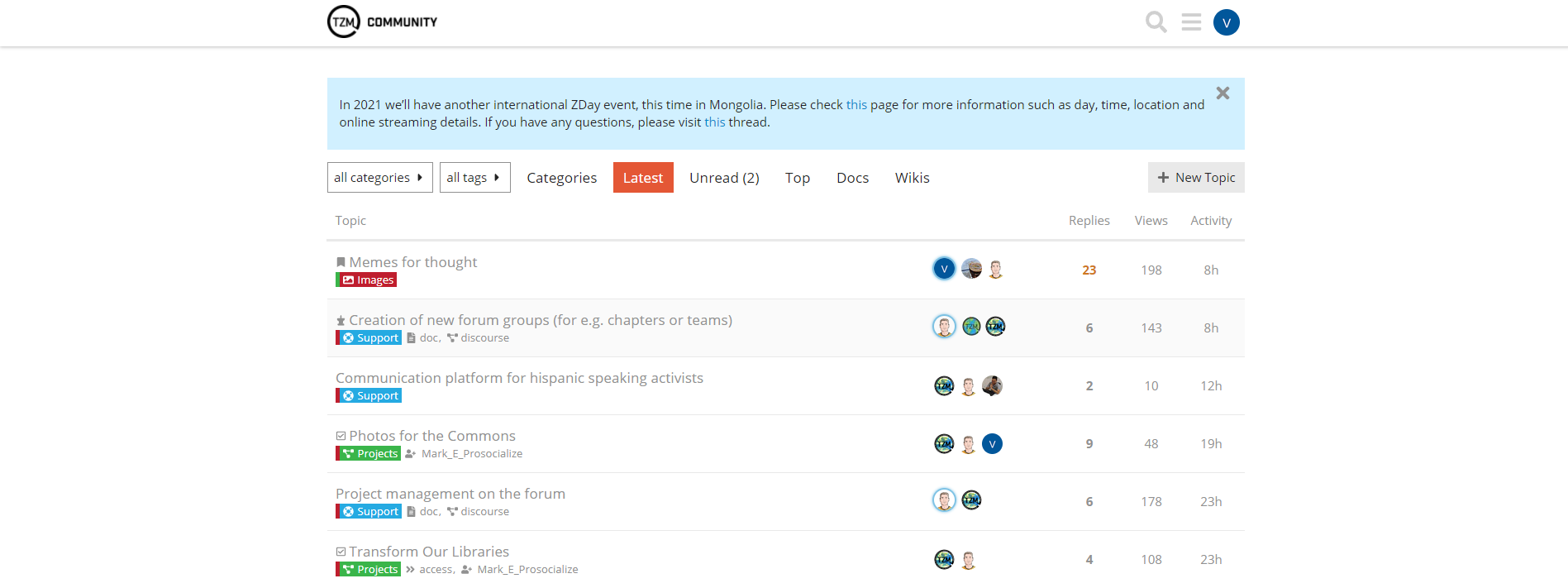
Do the category icons add something to the forum? I’m looking for a way to make the forum look more “fun”, but also easier to recognize categories. Do these help? Or is it only a distraction?
Now it looks great in the Latest Tab
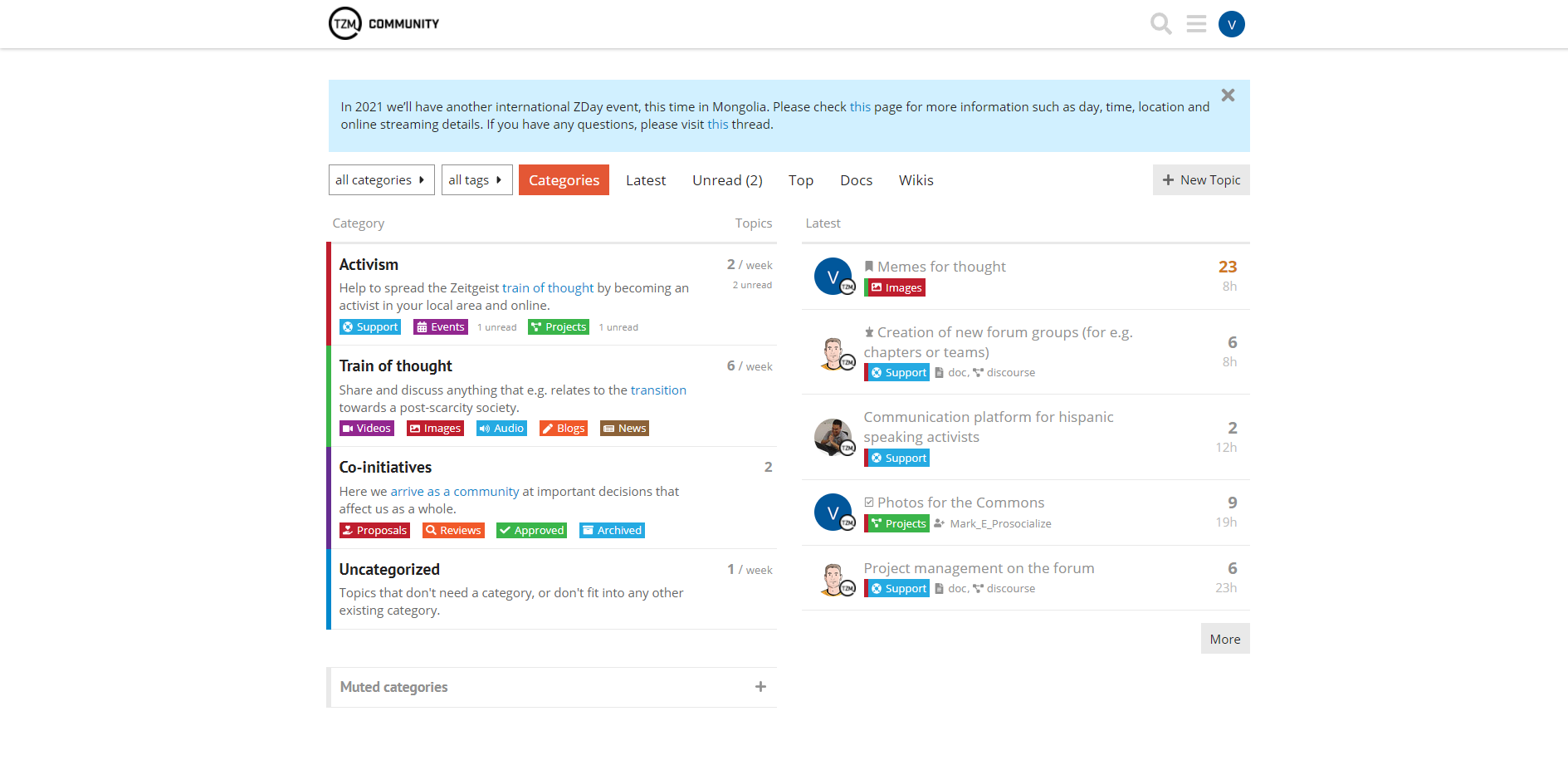
and it does not look too harmful in the Categories Tab.
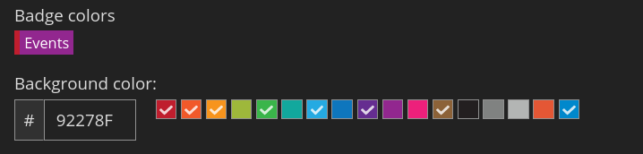
Maybe it’s just me, but the colors seem a little high contrast.
But it’s not a huge thing to consider prioritising and changing it.
I agree that the colors could use some fine tuning. I’ve selected the colors from the default pallet. You could experiment with the colors by modifying the CSS in your browser’s developer mode. In case you find some nice combination, share a screenshot and the color codes. Then we could consider to implement it